




There are color solutions that work “just okay.” And then there are those that literally catch your eye – where everything feels in its place, everything breathes, yet nothing strains the vision. The triadic color scheme belongs to the second category. It involves three colors equally spaced on the color wheel, creating a sense of completeness without the rigid feel of symmetry.
This is a rare combination. In reality, most beginning artists either retreat into safe monochrome palettes or grab two contrasting colors and suffer from aggressive visual noise. The triad is an elegant solution and, frankly, an unfairly overlooked one in the game development industry.
If you work with concept art, UI design, character creation, or environments, understanding triadic color harmony means adding a tool to your arsenal that will work for you time and time again.

What is a Triadic Color Scheme: Definition and Essence
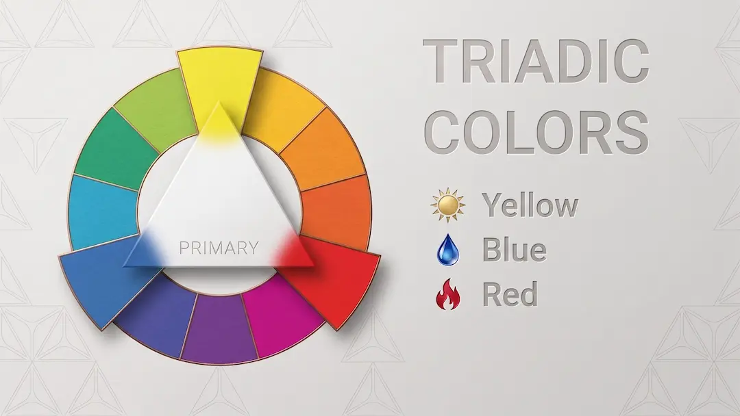
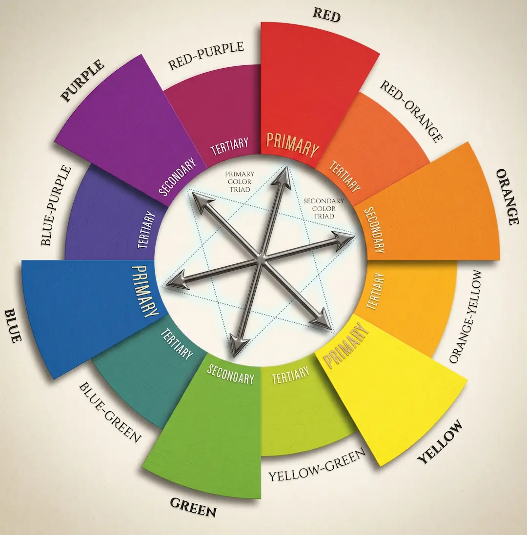
A triadic color scheme definition sounds simple: it is a set of three colors evenly distributed around the color wheel – specifically, three colors equally spaced on the color wheel exactly 120 degrees apart. If you take a standard wheel and draw two lines from any point at such an angle, you will get a triadic color palette. Geometrically, it is a perfect triangle inscribed in a circle.
While the triadic color scheme definition is simple in theory, what lies behind it in practice? The key is balance. None of the three colors dominates categorically, yet each plays its specific role. One becomes the base (dominant), the second supports it, and the third acts as an accent. This is precisely why triadic color harmony works: the system does not fall apart or turn into chaos.
The color wheel contains several classic triadic combinations:
– Primary triad color – red, yellow, and blue. This offers maximum brightness and contrast. It is aggressive and energetic.
– Secondary colors – orange, green, and violet. A bit softer, but still highly saturated.
– Tertiary triads – for example, red-orange, yellow-green, and blue-violet. Subtle, sophisticated, and full of nuance.
According to data from the Interaction Design Foundation, more than 60% of people accept or reject a product based on color, and up to 90% of first impressions about a brand are formed specifically through the color solution. This means that choosing a scheme is not just aesthetics for aesthetics’ sake; it is a communication tool.
Triadic Colors Meaning: Why It Works Psychologically
What is the triadic meaning in art? It is not just about three colors looking good together. The triadic color’s meaning is rooted deep in the psychology of perception: our brains look for patterns. Three equidistant points on a circle represent a pattern that is read as “complete” and “deliberate,” even if the viewer has never heard of color theory.
This leads to an important property: triadic color theory suggests that with the correct ratio of brightness and saturation, a triad creates a sense of dynamics without imbalance. This is exactly what a gamedev artist needs – the screen should feel “alive” but not exhausting.
It is vital to understand the difference between a triad and other schemes. A complementary scheme provides maximum contrast but easily shifts into aggression. An analogous scheme is calm and coherent but can seem monotonous. The triadic colors definition in art describes the golden mean: enough variety to hold attention and enough logic to let the eye rest.
How to Work with a Triadic Color Palette in Practice
The 60-30-10 Rule
This is a fundamental rule of triadic design – and it works everywhere: from interior design to character concept art. The distribution is simple:
– 60% – the dominant color (background, the main mass of the object)
– 30% – the supporting color (details, secondary elements)
– 10% – the accent (highlights, UI buttons, focal points)
You can break this ratio, but it should be done intentionally with a clear artistic goal. In practice, most problems arise right here: an artist takes three colors in equal proportions and ends up with a visual bazaar instead of harmony.
Tints, Shades, and Saturation: Working with Tone
The use of triadic colors and tints is a separate topic that is often ignored. Taking three colors from the wheel “as is,” in full saturation, is almost always a mistake. Work with tones: add white (tint), black (shade), or gray (tone). This allows you to maintain the color scheme while making it significantly more complex and readable.
For example, in a game UI: the main blue is saturated for buttons. The supporting orange is muted for background panels. The yellow accent is bright, used only for reward icons. This is no longer just “three colors”; it is a system.
Mood-Based Triadic Palettes for Game Genres
| Game Genre / Setting | Triad Type | Key Emotional Impact | Suggested Distribution (60-30-10) |
|---|---|---|---|
| Cyberpunk / Dystopian | Tertiary (Neon-based) | High-tech tension, nocturnal energy, artificiality. | Base: Deep Blue-Violet Support: Hot Magenta Accent: Electric Yellow-Orange |
| Cozy Indie / Life Sim | Secondary (Pastel/Muted) | Comfort, safety, organic growth, whimsy. | Base: Sage Green Support: Soft Apricot (Orange) Accent: Dusty Lavender (Violet) |
| Grimdark / Dark Fantasy | Primary (Desaturated) | Oppressive nobility, ancient blood, cold authority. | Base: Slate Navy Blue Support: Dried Blood Red Accent: Tarnished Gold (Yellow) |
| Sci-Fi / Space Exploration | Tertiary (Cold-Warm mix) | Clinical sterility vs. planetary discovery. | Base: Sterile Blue-Green Support: Burnt Red-Orange Accent: Warning Yellow-Orange |
| Retro Arcade / Platformer | Primary (High Saturation) | Instant readability, nostalgia, high dopamine. | Base: Royal Blue Support: Bright Canary Yellow Accent: Vivid Crimson Red |
Triadic Color Combinations in Gamedev: Real Examples
Specific triadic colors examples are found in games far more often than it might seem. Let’s look at the classics:
The Legend of Zelda: Breath of the Wild – the sky (blue), the grass and foliage (yellow-green), and the sunset haze and fire (orange). This is not an accident; it is a carefully calibrated triadic color palette that makes the world visually rich despite a relatively simple render.
Fortnite – the UI is built on a primary triad: blue (rarity), orange (legendary), and green (common). Color here serves a functional purpose, and it works instantly.
Hollow Knight – utilizes tertiary triads: cold bluish-gray cave tones, warm orange reflections of torches, and rare greenish fireflies. The result is an atmosphere without overload.
When a Triad is Not Needed
Honestly: triadic color combinations are not a universal weapon. For horror games with an atmosphere of claustrophobia and hopelessness, a monochrome or analogous scheme with desaturated shades is better suited. For hyper-realistic simulators, all triadic theory gives way to photo references. The choice of a scheme is, first and foremost, a question of the artistic task.

Fun Fact
The primary triad (red – yellow – blue) lies at the heart of most children’s toys and the logos of famous global brands – from LEGO to Google. Marketers have long known what color theory explains: these three colors create maximum memorability with a minimum number of shades.
Color Wheel Triadic Colors: How to Choose the Right Entry Point
Where do you start building a triadic palette in practice? Start with the dominant color – the one that defines the “character” of the work. This may be dictated by branding (if it is UI), mood (if it is concept art), or narrative (if it is an environment). Once the base is defined, the other two colors are found mechanically: 120° around the circle in each direction.
Then the real work begins. Adobe Color is one of the most convenient tools for quickly finding and testing triad palettes. Here you can immediately see hex codes, export the palette, and check the contrast for accessibility.
It is also worth mentioning saturation. To understand what are triadic colors in the context of digital art, you must see them as more than just three points on a circle – it is about managing the saturation channel. If all three colors are cranked to the maximum, you will get something psychedelic. If all are muted, you get a quiet, neat, perhaps slightly boring image. Playing with saturation contrast within a single triad is where the real mastery is hidden.
About Us
VSQUAD Studio was founded in 2015 and specializes in full-cycle game art outsourcing: 2D and 3D characters, environments, hard-surface, vehicles, animation, and VFX. Over 10 years, we have supported 50+ projects – from indie teams to AAA studios. Our works have appeared at Steam Festivals and Gamescom Latam, and some projects have received Epic MegaGrants funding. In 2024, the company was honored with the “Consumer Choice” award. We can integrate into your pipeline within 48 hours.
FAQ
It is a set of three colors positioned evenly on the color wheel – each separated by 120°. This arrangement creates visual balance and, at the same time, sufficient contrast between the colors.
A complementary scheme consists of two opposite colors on the wheel. It provides maximum contrast but easily becomes aggressive. A triad works more softly: three points instead of two create balance rather than a direct confrontation.
Yes. You can “hide” the triad – take three colors but significantly lower the saturation of two of them. The base color will remain dominant, while the others will be read as neutral supporting tones.
The triad itself consists of 3 base colors. However, in practice, the palette expands through the tints and shades of each of the three: usually up to 9–12 shades. This constitutes a working triadic color palette for a project.
The classic approach: the dominant color is for backgrounds and panels, the secondary is for buttons and interactive elements, and the tertiary is for accent states (hover, selection, notifications). This makes the interface readable and visually coherent.
Not for all. A bright triad works well in action games, platformers, casual, and mobile games. For horror, psychological thrillers, or realistic simulators, analogous or monochrome schemes with muted tones are better suited.
Three Colors, One System: How to Bring a Triad to a Result
Triadic color theory is not an academic abstraction. It is a practical tool that simplifies one of the most difficult decisions in visual design: how to make an image interesting yet readable. Three colors at 120° intervals on the wheel – and you already have a system that works.
The main thing is not to stop at just picking a palette. Saturation, distribution according to the 60-30-10 rule, and working with tones are where the scheme turns into art. If you want to analyze a triadic palette on a real project or need help with the color direction of your game, contact us → 📩 head@vsquad.art or schedule a call.
Get in touch
Got a project in mind? We usually reply within a day.