
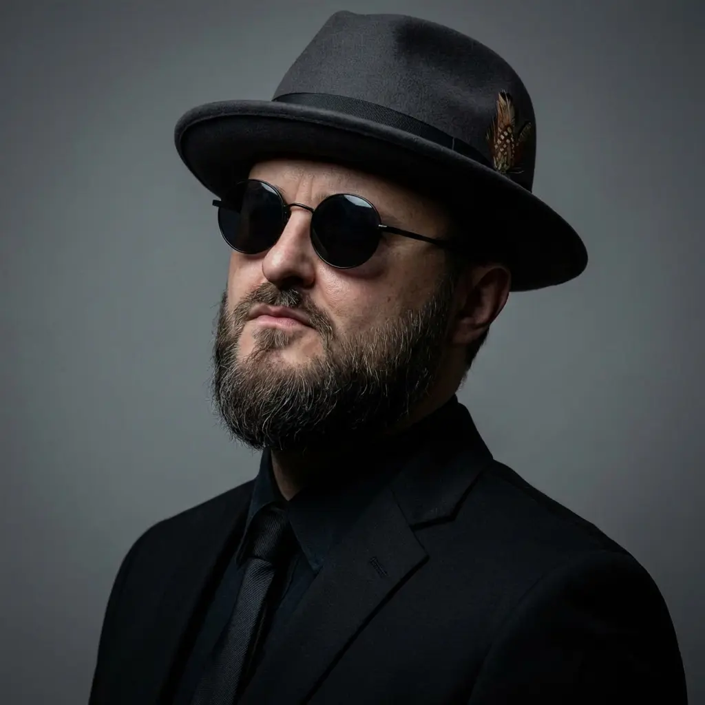


Danila Vlasov is an art director and concept artist with long experience across game art production, 2D art direction, visual development, and art leadership. His work includes projects such as Overlord, Ice Age World, Dragons World, EverQuest, Need for Speed, and other game-related production work.
In this interview, we talk about how game art direction works in real production: how visual style is built, why it often breaks during development, what makes an art bible useful, how to keep artists aligned, and what clients or small teams should prepare before bringing external artists into the pipeline.
Main topics
Game Art Direction
Concept Art
Game Production
Art Bible
Visual Development
Interview
Q: You’ve worked across very different game projects and visual styles over the years. When you look back at that experience, what kind of projects shaped your view on game art direction the most?
A: It was not beautiful presentations that shaped me. It was the projects where I saw how everything actually works. Not inside a pitch deck, but when things are already burning, everyone is tired, and every day someone comes in with the classic line: «Can you just change it a little?»
At first, you are a young artist and you think only about your own image. You want the character to look cooler, the weapon to feel meaner, the scene to have more atmosphere. You think that if the art is strong enough, the rest will somehow fix itself. Then you understand: a game is not an art book. A beautiful image solves nothing by itself. A character has to read in combat. UI has to work under pressure. Style has to survive not one key image, but hundreds of assets made by different people under stress.
Different projects taught me different things. One taught me that readability is more important than beauty. Another showed me how quickly style turns into mush if nobody holds it together. A third taught me that the most practical solutions rarely come from inspiration. They come from production pressure, when you are too tired to perform genius and finally ask the real question: what does this game actually need so it does not fall apart?
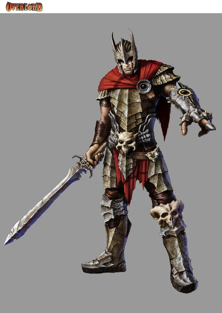
Q: You mentioned Overlord as a project that stayed in your memory. What made that experience important for you as a young concept artist, especially when working on characters, weapons, creatures, or world elements?
A: Overlord was important because at some point I understood that what I was drawing was no longer just portfolio images. It was going into the game. People were actually playing with it.
I remember one moment very well. I walked into a computer club near the railway station in Kyiv, and several people were playing Overlord. Real players, real screens. And there was a character I had been involved with. For a young concept artist, that hits hard. Not «my art passed review». More like «this is now part of someone’s experience».
That project also taught me something else. A concept artist in production is not drawing a beautiful fantasy. He is making material for the next people in the chain. The modeler has to understand the form. The animator has to understand how it can move. The team has to understand what world it belongs to. If it looks cool but has no internal logic, the problems will come out later. Not in the concept, but in the build.
Style is not decoration. It is a system that either holds everything together or starts to crack.
Q: At what point did you start thinking not only as an artist, but as someone responsible for the whole visual direction of a project?
A: It happens when you stop asking «is my image good?» and start asking «does this help the project, or is it already hurting it?»
First you notice mistakes in specific artworks. Then you start seeing mistakes in the process. A weak brief. Blurry priorities. Feedback from five people, each of whom sees the game differently. The artists are strong, but everyone is pulling in a different direction. And at some point you understand: the problem is often not skill. The problem is that there is no shared visual agreement.
That is where art director thinking begins. You are no longer just drawing. You are protecting the project from quietly spreading apart.
Q: For people outside the art team, “art direction” can sound abstract. How would you explain what a game art director actually protects during production?
A: An art director protects the face of the game.
At the beginning, almost everything looks convincing. There are mood boards, references, beautiful words about «unique style» and «strong atmosphere». Everyone is charged up. Everyone is sure they understand what kind of game this will be.
And then production arrives.
Deadlines arrive, technical limits arrive, fatigue arrives, and personal taste starts walking around the room like it owns the place. One person wants it «heavier», another wants it «more epic», the third wants it «like that successful game». And if nobody holds the course, the project slowly loses its face. It may still look beautiful in places, but it is no longer whole.
The art director keeps asking: «Is this still our game? Or have we already started building Frankenstein out of random references and panic revisions?»
Q: When a game has many assets and several artists involved, what usually causes the visual style to drift or become inconsistent?
Because the style was either not clearly defined, or nobody protected it. That is the boring answer, but usually the most accurate one.
Every artist has habits. One loves detail, another simplifies, a third pushes contrast. They can all be good specialists. But if there are no shared rules, everyone starts solving the task through personal taste. And personal taste is not art direction.
A folder of references without explanations quickly turns into visual noise. One person sees color, another sees form, a third sees mood. Formally, everyone can be right, while the project has already started sliding.
Late feedback only makes it worse. When the wrong direction gets corrected after ten assets are already done, that is no longer style management. That is firefighting. And in production, temporary becomes final very quickly.
Q: A lot of teams talk about art bibles and style guides. In your experience, what makes them actually useful in daily production, not just nice documents that nobody opens?
A useful guide is not a presentation made for internal comfort. It is a working tool.
It has to answer the questions an artist asks every day. What is our shape language? What proportions do we use? What level of detail is normal, and where does it become too much? How do materials work in this world? What is allowed, and what immediately breaks the mood?
I once opened a beautiful document like that. Lots of renders, lots of pages. But there was not a single word about how metal should be painted specifically in that game. I had to call the author and ask directly.
A good guide saves time. The artist opens it and can make a decision without yet another call. A bad one looks expensive, but in reality it is just visual bureaucracy.
Q: Where is the line between a strong concept image and concept art that is really ready for production?
A strong image impresses people. A production concept helps other people build the game.
You can draw something very effective: light, drama, details, beautiful rendering. Everyone likes it. Then the modeler looks at it and does not understand how the form is built. The animator does not understand how it should move. The environment team does not understand the scale or materials. And suddenly you have a beautiful image that is almost useless for real work.
A production concept has to answer the questions of the next person in the chain. How is the form built? Which proportions matter? What is the main thing here, and what is just decorative noise? What happens after optimization? Will the idea survive once it enters the build?
Beauty without clarity often becomes an expensive problem in production.
Q: What kind of feedback helps artists move faster and stay aligned, and what kind of feedback usually creates confusion or extra rework?
Normal feedback usually gives three things: what exactly is wrong, why it is a problem, and where to move next.
Bad feedback is a stream of feelings. «It does not grab me». «Make it more interesting». «Maybe more epic?» That is not feedback. That is noise. There may be a real problem behind the feeling, but until someone translates it into concrete words, the artist starts guessing. And guessing in production costs money.
Good feedback is tied to the goal. «The silhouette is too similar to another enemy, the player will confuse them». «The material feels too technological for this world». «The icon does not read on a small screen». Here, both the problem and the direction are already clear.
Timing matters too. If someone spent a week polishing the wrong direction and only then heard «actually, we saw it differently», the problem is no longer only the artist. The problem is the process.
Q: You also worked on mobile and social game projects. What changes in art direction when the game needs to be readable fast, work on smaller screens, and support a large amount of content?
In mobile games, readability becomes merciless. You do not have time to hope that the player will study your beautiful image. They have to understand instantly: who is this, what does it give, is it dangerous or not, where do I tap?
A small screen strips vanity out of art very quickly. Something that looked cool at high resolution can turn into mush inside the actual game. Details disappear. A weak silhouette dies. Poor contrast becomes obvious.
On top of that, mobile projects often require a huge amount of content. Events, icons, offers, skins, UI states. The style cannot be so fragile that only one senior artist in a good mood can reproduce it properly. It has to scale.
And this is where you immediately see who is making a picture for themselves, and who is making art for the game.
Q: If a small studio or indie team wants to bring external artists into production, what should they prepare first to avoid wasting time and budget?
First, they need a proper brief.
Not a mood. Not «something in this direction, but our own». Not a napkin sketch. A proper brief.
At minimum, references with explanations. Not just a pile of images, but notes: what exactly matters here? Color? Shape? Materials? Level of detail? And what definitely should not be there. Negative references sometimes save more time than positive ones.
Also: an asset list, priorities, technical requirements, formats, platform, deadlines. Who gives final approval. How feedback works. How many people are allowed to comment. And who makes the decision when opinions split.
It sounds boring, but this is exactly what saves money. Most chaos does not start because the artist is bad. It starts because the team itself does not fully understand what it wants, but for some reason expects an external person to guess the game inside their heads.
Even a small style guide is better than nothing. A few pages with rules and examples of «allowed» and «not allowed» can save a lot of nerves and time. Without a map, you are not plugging a specialist into production. You are sending them into fog, and then acting surprised when they do not arrive where you imagined.

Consolution
Good art direction is not about making every illustration look more impressive. It is about giving the whole team a clear visual direction that survives production. When everyone understands the style, concepts answer production needs, and feedback is specific, the project moves forward instead of constantly correcting itself. As Danila Vlasov points out, visual problems usually come not from the artists, but from unclear processes, mixed priorities, and the lack of shared rules.
Explore more behind-the-scenes stories in our exclusive interview series. We have many more conversations with industry visionaries coming soon, so be sure to visit us again.
Get in touch
Got a project in mind? We usually reply within a day.